You are using an out of date browser. It may not display this or other websites correctly.
You should upgrade or use an alternative browser.
You should upgrade or use an alternative browser.
GraphicX8000v5_5.wad - [Version 5.5 RELEASED!]
- Thread starter SonicX8000
- Start date
-
- Tags
- srb2 v2.0.x
- Status
- Not open for further replies.
W-o-o-o-aah-aaah! The new version is too beautiful !
Q: Move the auto ring up a little bit.
A: All icons in the Rings are the same pixel size and in the same place, it's just the way the Auto icon is shaped is what makes it look too low.
Do you know why automatic ring looks a tad out of center? Because the center of a triangle is at 1/3 of its height, not at 1/2.
Nonetheless, I doubt anyone will compare, with set-square and ruler, an auto ring panel with another panel in the middle of a match; it's a matter of visual feeling, so I'd consider moving it 1 or 2px up, in my opinion.
Last edited:


I swear trying to get these to look decent takes time, yay, the Red Ring looks good, fffffff, the Blue Ring looks horrible, alrighty... made the Blue Ring decent, fff... Red Ring looks bad, hopefully these Rings gets the job done.
Last edited:
I just think the bright shading on the blue one needs to be slightly darker, other than that it's sexy. :3
And then the Red Ring gets changed as well if I try to make the Blue Ring darker. TRNG*0 is the Team Rings, only it's Green which changes into Red/Blue ingame.
I just think the bright shading on the blue one needs to be slightly darker, other than that it's sexy. :3
Hmm ... maybe that red should be more clear, to me. The dark side look like the classic SRB2.
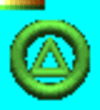
There, I moved the Auto Ring up, now leave me alone. -_-
And now's the time to roll out the item list, and I think these will be final.

Last edited:
Metal-Rawr
Also known as Teravolt now
... The Random Monitor kind of bugs me, it looks like steel/metal is INSIDE a monitor screen, I don't know, just looks... odd. =\

New font. (Different res's that you use will cause the Act number to not connect correctly or something.)
And yes, this was the only level that I could find that has the longest text in the title card, I mean... the text is small after all.
(Warning: For some odd reason, XWE corrupts the U & W of the text font, yet it shows fine ingame.)
Last edited:
And yes, this was the only level that I could find that has the longest text in the title card, I mean... the text is small after all.
You haven't seen the latest OLDC then, clearly. As for the title cards, I'm not a big fan on gradient abuse. It just looks like I've seen it everywhere.
The name of the levels is a particular design .. I've seen this somewhere. It looks like the SONIC 3 level name design. They are simple but effective.
However .. I have two small comments, tell me what do you think :
- The cross on the left of the number of lives is too glued to the character's head.
- There are no graphics in the menu Score / Time / Rings (No pictures) ? He looks a bit poor, as menu. There are only white and gray colors.
EDIT : Ah, actually there is the image of the ring. But I think we should add a little something left to the score ...
Last edited:

Special Stage Token.
- The cross on the left of the number of lives is too glued to the character's head.
Sonic's Life Icon is bigger than Tails & Knuckles Life Icons, so that's why it's too close to the X.
I once had a clock icon for the time but scrapped it, however... I may add the SCORE Icon back and move the score to the upper right corner of the screen, however... Item icons will block it in first person view.- There are no graphics in the menu Score / Time / Rings (No pictures) ? He looks a bit poor, as menu. There are only white and gray colors.
EDIT : Ah, actually there is the image of the ring. But I think we should add a little something left to the score ...
Last edited:
Kim the Fox!!!
What am I doing here?
Hmm... I think you should make it look like a true token. Make a constant color-changing coin with an emerald in the center.
Hmm... I think you should make it look like a true token. Make a constant color-changing coin with an emerald in the center.
I'm changing it back to the old Ring with the Emerald in it, because I think I manage to change the Bubble into a extra frame for the Token.
Code:
Thing 51
MAPTHINGNUM = -1
SPAWNSTATE = 0
SPAWNHEALTH = 1000
SEESTATE = 0
SEESOUND = 0
REACTIONTIME = 8
ATTACKSOUND = 0
PAINSTATE = 0
PAINCHANCE = 0
PAINSOUND = 0
MELEESTATE = 0
MISSILESTATE = 0
DEATHSTATE = 0
DEATHSOUND = 0
XDEATHSTATE = 0
SPEED = 8
RADIUS = 524288
HEIGHT = 1048576
MASS = 100
DAMAGE = 0
ACTIVESOUND = 0
RAISESTATE = 0
FLAGS = 513


FRAME 526
SPRITENUMBER = 44
SPRITESUBNUMBER = 32774
DURATION = 2
NEXT = 527
ACTION None
VAR1 = 0
VAR2 = 0


FRAME 527
SPRITENUMBER = 45
SPRITESUBNUMBER = 32768
DURATION = 2
NEXT = 520
ACTION None
VAR1 = 0
VAR2 = 0
And there you go, teh Token with the 8th removed Black Emerald.
Emerald changes from Green, Yellow, Purple, Blue, Red, Cyan, Grey, Black in that order, also the Ring moves.
Now to stick this into the MAINCFG, so XWE better not corrupt it.
Last edited:
This token (ring and emerald) is really better. Keep it.
- Status
- Not open for further replies.
Who is viewing this thread (Total: 5, Members: 0, Guests: 5)
Share: